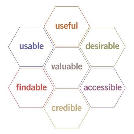
User Experience Honeycomb by Peter Morville
"The honeycomb hits the sweet spot by serving several purposes at once."
First, it’s a great tool for advancing the conversation beyond usability and for helping people understand the need to define priorities. Is it more important for your web site to be desirable or accessible? How about usable or credible? The truth is, it depends on your unique balance of context, content and users, and the required trade-offs are better made explicitly than unconsciously.
Second, this model supports a modular approach to web design. Let’s say you want to improve your site but lack the budget, time, or stomach for a complete overhaul. Why not try a targeted redesign, perhaps starting with Stanford’s ten guidelines as a resource for evaluating and enhancing the credibility of your web site?
Third, each facet of the user experience honeycomb can serve as a singular looking glass, transforming how we see what we do, and enabling us to explore beyond conventional boundaries."
Facets of the User Experience
- Useful. As practitioners, we can’t be content to paint within the lines drawn by managers. We must have the courage and creativity to ask whether our products and systems are useful, and to apply our knowledge of craft + medium to define innovative solutions that are more useful.
- Usable. Ease of use remains vital, and yet the interface-centered methods and perspectives of human-computer interaction do not address all dimensions of web design. In short, usability is necessary but not sufficient.
- Desirable. Our quest for efficiency must be tempered by an appreciation for the power and value of image, identity, brand, and other elements of emotional design.
- Findable. We must strive to design navigable web sites and locatable objects, so users can find what they need.
- Accessible. Just as our buildings have elevators and ramps, our web sites should be accessible to people with disabilities (more than 10% of the population). Today, it’s good business and the ethical thing to do. Eventually, it will become the law.
- Credible. Thanks to the Web Credibility Project, we’re beginning to understand the design elements that influence whether users trust and believe what we tell them.
- Valuable. Our sites must deliver value to our sponsors. For non-profits, the user experience must advance the mission. With for-profits, it must contribute to the bottom line and improve customer satisfaction.
Recommended Resources
